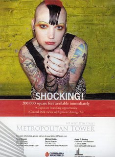
Corporate Real Estate Stooges Redefine "Shocking"
 (click image)
How this ad was conceived:
1. Decide headline should be "SHOCKING!"
2. Royalty-free stock search for "shocking"
3. Buy photo.
4. Do hackneyed 2/3rds photo, 1/3rd text layout.
"200,000 square feet available immediately?!?" That's fucking punk rawk, Cushman & Wakefield (both of whom are long dead, btw)!!! West 57th is EDGY! Central Park views—Goth! Private dining club—Fight The Power! (scanned from this week's Crain's New York)
some previous NYC realty posts:
1. Taglines are DUMB: NYC Real Estate edition.
2. The Unparalleled Hyperbole of NYC Real Estate Ads.
3. CLEARLY defining your target audience.


9 Comments:
It's shocking that someone would consider this photo relevant past 1995.
Diversity has a newer mascot.
That wouldn't even shock a minister in Dimebox, Texas.
It's shocking that someone would go to such trouble to be so punk rock and then sell-the-fuck-out to a stock photo company.
JenG
Get that creature out of my building -- now!
why do they always insist on putting a slammer on the headline?
i think shocking has more impact without an exclamation. then is can also double as a description of the ad.
Need to go for a more universally shock factor.
Shocking is seeing a sphincter with the diameter of a DVD after getting fist-fucked.
Never ceases to amaze -- and shock --- no matter how many times I see it.
Who doesn't have an initial reaction of, "Whoa!!!"?
Case in point...
http://sam.zoy.org/goatse/anus.jpg
That's a bit more shocking. And communicates the spaciousness of 200,000 square feet.
Roomy indeed.
I worked as the copywriter for the ad agency that is responsible for this ridiculous ad. I had never even seen the final. I assumed this terrible idea was canned. Thanks for reminding me why I quit! PS - try and imagine the images the art director rejected...
Post a Comment
<< Home