

Perrier. Shittier.
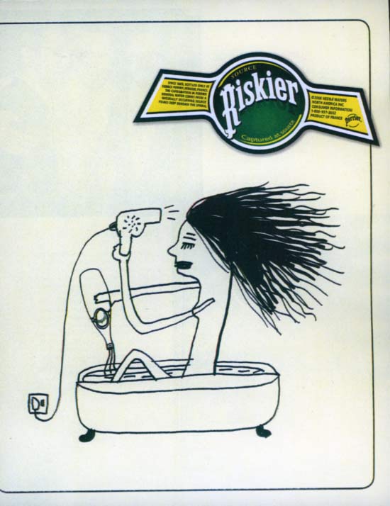 Drinking bottled water is in fact "riskier" (there are zero FDA quality regulations over the industry). But, I don't think that's what Perrier had in mind for their new campaign ( a 2nd ad says "Scarier", with a rollerblading man pouring water over his head while cutting his hair. or something. it honestly made no sense to me.).
I don't understand why they're trying to make their water with bubbles seem "edgier" than other water products. Do you really expect people to buy this strategy? Nice clean layout, though.
(scanned from the latest Black Book)
previously:
1. "C'mon baby, it's low in calories."
2. ABSOLUT KRAP.
3. DEAD BULL: Victorious Matador.
posted by copyranter @ 8:50 AM
![]()
![]()
8 Comments:
I think I see a bare breast!
This ad is bad. Just like the snickers "snackfabtastictaste" crap.
I always thought Perrier was more upscale than this really childish ad
boy is she ugly
did neckface draw that?
God forbid Perrier should risk making an iota of sense. That would be so uncool.
Does anyone know which agency is responsible for this campaign? Or which distribution company is responsible for wild posting these ads on every construction site in New York City?
It looks like a David Shrigley drawing.
Drop the dryer
Post a Comment
<< Home