Wednesday, August 11, 2010

Norwegian Smart Car Ads Too Smart For This American Dumbass.


(click ads, via) I get the general message that the teeny-tiny autos are good for the environment and my breathing. But I don't get why Smart Cars are buried underground with trees growing out of their tailpipes. And, while cars and lungs are very generally the same shape, I'm not quite feeling the smartness of the Smart Car lungs tailpipes/windpipe medical diagram thing. Ads by Oslo agency Futatsu Industries. Previously: new US Smart Car ads as cute as a bug's ear. • cute Smart Car street promo via Toronto.

Friday, March 12, 2010

...especially if your vehicle suddenly accelerates and flips over.

(click billboard, via) Unfortunate board for an Ogden, Utah Toyota dealership. Previous scary car dealership ads:
Car dealer ads are a gift from Satan.
• 'Dis is how they do subliminal sexual car ads in Queens.

Thursday, June 23, 2011

One of the sleaziest car ads ever just won a Cannes Lion.

(click ad, via) A Press Silver Lion. It's promoting pedophilia? Or at the least, statutory rape? It's certainly a skeevy ad, Kia. What do you expect when virtually 100% of the judges are undersexed unattractive men? And I'm assuming it's a produced ad, since Cannes' #1 concern has always been integrity, not profitability. The ad doesn't even visualize the benefit very well. Ha, look at the apple (pussy) juice sluicing out of teacher's mouth. Ad agency: Moma, São Paulo, Brazil. Go jerk off, Brazil.
update: Kia America's response in the comments.
Previous sleazy car ads:
Used Woman = Used Car.
Pre-owned girl sells pre-owned BMWs.

Monday, March 03, 2014

American Car Ads are a Fucking Embarrassment.


If you watched the Oscars last night, you probably saw the above "American Exceptionalism" Cadillac commercial. It is, politics aside, one of the worst car commercials ever produced.  But it's just the latest in a shitty string of awful American car ads.
Read on VICE.

Thursday, September 18, 2014

On EXTREME Copywriting.

 (2010 billboard. A phone is a bucket. With knuckles. Filled with female deer.)

At some point, in the last seven years or so, advertising copywriters started an EXTREME headline movement—in your face, provocative ads that make absolutely zero sense. Why this movement is happening now, and didn't happen back in the Xtreme 1990s, I don't know.

 This type of phenomenon happens often in our industry: the same creative linchpin pops up nearly simultaneously, all over the world. Sure sometimes it's just blatant idea larceny by shameless creative directors, or idiotic clients who say something like "Did you see that dancing babies ad? I want dancing babies in my ads."

But often, it's just an unexplained karmic mystery where copywriters/art directors have the same idea at the same time. Veteran ad creatives know what I'm talking about.

Anyway: the current main executor of this EXTREME headline movement is Wrigley's 5Gum, and their Chicago ad agency, Energy BBDO. But at about the same time that 5Gum launched, Ruffles and Cheetos (both PepsiCo brands) also started putting out EXTREME ads. Soon, several other brands also jumped on the EXTREME train.

But I think, if you're going to go EXTREME, than why not go FULL FUCKING RETARD EXTREME? Therefore, I've rewritten—pushed the envelope, we call it the creative department—some of these recent EXTREME ads.

Trident

(click to enlarge)

A couple of months ago, I stepped into an A train car that had been taken over by a new Trident campaign. This poster, in particular, made me gape. Chewy nunchucks? Nunchucks are unwieldy. I think my EXTREME Islamic take makes for a more explosive, targeted ad.

(click to enlarge)

If you're going anthropomorphize cavities as passive-aggressive stalkers, well then I say make them felonious terrorists.

(click to enlarge)
What the fuck is a mouth office?
Why not be proactive, instead of anthropomorphizing your gum sticks as passive "guards"? Make them armed-to-the-teeth (sorry) aggressive killers!

Ruffles & Cheetos

(click to enlarge)

These two PepsiCo snacks went violently EXTREME to hawk spicy sub-products. But again, especially when considering the Bro Demographic target, I don't think they pushed it enough.

(click to enlarge)
That's better.

5Gum

(click to enlarge)

From 2007, this (L) was the first 5Gum ad I noticed (scanned from ESPN Magazine). 5Gum is so named because it supposedly appeals to all five senses. How does it appeal to sound? It's not bubble gum. No matter. First of all, you'd have to be Gulliver on Lilliput to be able lie on 1,000 cell phones. But fuck logic: this is EXTREME copywriting.

The message here is "tingling". Why not get tingled to death (R)?

(click to enlarge)

5Gum spearmint is so powerful, it takes over your body (very believable). And it lasts so long, if you chew a piece for a week, the flavor replaces your blood, eventually turning you into a refreshing zombie.

(click to enlarge)

The marketing geniuses at 5Gum decided to name their wintergreen product "Cobalt". Forgetting that if you tried "speed skating on dry ice," you'd break your neck, let's focus instead on Cobalt (chemical element "Co", atomic number 27). Cobalt is highly toxic, and "reasonably anticipated to be a human carcinogen", according to the CDC. Now that's EXTREME.


This is a still from one of 5Gum's equally bombastic TV spots.
The copy is added.

(click to enlarge)

Another one.
Needed more electrifyingness.

(click to enlarge)

No, I've never tried that (L) because I'd be dead.
Let's call a tidal wave what it is, and provoke more FEARFUL fun.

(click to enlarge)

 These two ads were art only, so I added EXTREME headlines.

(click to enlarge)

More recent executions have been creepily sexually anthropomorphic.
Fuck 1st base, let's go hard to 3rd base, baby.
__________


Thursday, September 25, 2014

Starbucks Ads Target "Complete Moron" Demographic.


SOMETIMES
THE BEST WAY
TO CONNECT
IS TO GET TOGETHER.

This is the no-duh sign-off line of new commercials via the $15 billion chain. These ads are what's called a "soft sell", as opposed to your local screaming car dealership commercials, which are "hard sell". Starbucks is soft-selling "getting together". Then, their logo oh-so-very-subtly suggests "getting together" at one of their impersonal cookie cutter building holes, as opposed to a billion other better places, including caves, highway rest stops, or if you need a cup of coffee (for free), "connect" at an AA meeting or the aforementioned local car dealership (just look at a couple of cars, grab some coffee, sit down, start connecting, and ignore the salesman, he won't kick you out).

The creative linchpin of the ads is this: show text conversations with v/o of the texters holding the same conversation in person, which shows HOW MUCH BETTER it is to communicate face-to-face. Well fuck me in the ass and call it Christmas, THANK YOU, Starbucks.

To the spots.

"Apology"


BOYFRIEND: "I know that look...I should get you some flowers, or something..."

Who wrote this dogshit (apparently Dana Stalker, senior copywriter, BBDO NYC)? Great conversation! Great connection! The scenario perpetuates the infuriating stereotype of coy women making stupid men guess whether they're mad at them, and if so, what they're mad at them about. Fucking wonderful.
I could write three (3) better "apology" ads right the fuck now, in the next hour (No, I'm not doing it, I don't work for fucking free).
This spot makes me want to go to—not Starbucks—but a shitty bar and drink several shots of whiskey—which Starbucks might soon offer.

Wait. Maybe this campaign is smarter than I think?

"Date"


Another fucking cliched boilerplate conversation, this time between goofy girlfriends: 
What was he like?!?
You like him!!!!!
No I don't!!!!
Yes you do!!!!
Shut -up!!!!
No you shut-up!!!!
__________

But then, the spots do feature "text messaging", so maybe you Millennials are enthralled to watch "text messages" that you yourself haven't written. The drama. And heck, AdWeek, the world's leading ad critique website, according to themselves, called the ads "clever".

I can't believe this is the best BBDO could come up with. Just, sad. They used to be a pretty good agency, for a fucking behemoth. What the hell happened, David Lubars?

Friday, August 14, 2009

Yet another car marketed to male losers.


(click ads) Headline: "They will see something beautiful in you." It is one of the oldest and most dubious of car marketing strategies: people will find you more attractive/fuckable in one of our sexy autos—this time, it's the not-very-sexy Mitsubishi Lancer Evolution X. Creative lesson for ad agency Leo Burnett in Costa Rica: If you're going to go this (bad) executional route, you should make the men much uglier, hideously ugly. Then, guys who look like these fairly normal looking guys won't be insulted by your trite, outdated idea (images via).
Previous terrible car ads
: Nissan. Ford Fusion. Mazda. VW Beetle. Pre-owned BMWs. Porsche.

Wednesday, October 27, 2010

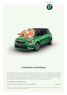
Cheap sports car sold with cheap cut-out pinup bikini girl.

(click ad to read, via) Well, this is either a little less sexist or appallingly more sexist than a real pinup bikini girl fuck-splayed across the car's hood would be. I really can't decide. I can decide that it is a fucking strange-ass ad for the Skoda Fabia RS by Amsterdam ad agency Selmore. Weed, dudes? Previously: These Skoda Yeti ads are quite possibly the stupidest car ads ever.

Wednesday, November 24, 2010

The Flirt Vodka Oral Sex Ad Series™ continues...


(click ads) Previously in the Bulgarian Vulgarian "Keep Memories Alive" campaign, we've seen a drunk driver getting a blow job in his car. And, a woman with scraped knees, presumably from giving a blow job. Here (L), we have a park bench BJ (headline translation: "he said he was star gazing"), and (R) some restaurant cunnilingus (headline: "she said she was going to take some time with the menu").
It's the unsubtleness of these ads that fascinates me. In America, we have "blow job" vodka ads. We just don't have blow job vodka ads. Thanks to Omri for the ads/translations.

Tuesday, November 27, 2007

...and God can smite you better.

(click ad for closer look)
Like me, do you evilly laugh every time you see a Porsche disabled on the side of the road? It's really an unfair—though automatic—reaction to immediately think "prick" whenever we see one, isn't it? (In American auto ads, the car is usually the cock. $69 down!) Unfortunately, the dicky tone of the German car manufacturer's advertising does absolutely nothing to discourage that reaction. And frankly, if headlines like this one make you want a Porsche, you deserve all the micro-penis-douchebag thoughts directed your way, Helmut.
previously in auto ads:
1. Taylor Hicks for Ford: a review.
2. Car dealer ads are a gift from Satan.
3. Taglines are DUMB: NYC Auto Show edition.
(image via)

Thursday, September 11, 2014

BREAKDOWN! Why David Fincher's New GAP Ads Are Fucking Terrible.


BREAKDOWN! is a new semi-regular bullshit clickbait copyranter feature where I "break down" why popular new ads that most people like are in fact "Fucking Terrible".
____________________

GAP hired Fincher, Hollywood hero to both faux-tough misogynistic MRM douchebags (Fight Club) and passive-aggressive noodle-armed misogynistic tech douchebags (The Social Network), to shoot its new Fall denim commercials.

And man, are they bad.

What's usually not clear when a brand/ad agency brings in a big shot film director is how much of the resulting work was the agency's idea and how much was the director's. But I'm guessing since it's motherfucking Fincher, GAP/Wieden & Kennedy NYC gave him the freedom to shoot whatever the Hell he wanted as long it was good-looking Gen Y's/Gen Z's wearing denim.

Fincher's goal with these "films" was to create "positive anxiety", according to GAP's poetic press release. Huh. The feeling they evoke in me is more "negative nothingness". Watch and see what you feel.

"Drive"


"The uniform of rebellion and conformity".

Uniform. Rebellion. Conformity. Ying-Yang-ish soaked beautiful girl removes her wet GAP jeans in car and carelessly, rebelliously throws them in the front seat between a beautiful GAP-wearing couple (Not her parents, I guess. Woman is too young.) Not-as-beautiful-as-the-other-three backseat friend is not amused. Bearded man is resigned. Woman is very concerned. What acting! Note that woman is driving some kind of vintage car. The vintage music is "L'amour la Mort" (love death) by French jazz pianist Martial Solal from the 1960 Jean-Luc Godard film "Breathless". The car and music are meant to invoke "timelessness".

What mystery! What positive anxiety! What pointlessness! But, that's the point, you see. Life is pointless. And dark. And normal. So, Dress Normal. Or something. Fuck narrative, and fuck you, consumer.

Do you now, finally, want to wear GAP clothes?
I didn't think so.


"Golf"


"Let your actions speak louder than your clothes".

So, don't dress like this, I guess.

Presumably this is a couple: smoking (Or is it a toothpick? Such dark mystery.) skinny jeans-wearing anti-golfer golfer; bored, Capri jeans-wearing dancer. Oh my GOD, it's like a scene from a David not-Fincher but Lynch film! Is the hipster golfer going to kill and dismember his annoying girlfriend? I know this much: I wouldn't leave his vintage BMW sitting there with the keys in it, stupid dancing soon-to-be-murdered girlie.

Music: "Wait A Minute Girl" by The Newday, for those of you who care about such things.


"Kiss"


"Dress like no one's watching".

Eh, what the fuck does that mean?

Anyway. Three men. Two of them, bearded (hipster golfer may have stubble, hard to tell). Though, this man's beard is actually a spray-on beard, because his real beard was destroying the actress's face from having to do so many takes for asshole Fincher (true story).

Wonder if the 4th spot will feature a bearded man?
This is about the only thing dramatic or "anxious" about this campaign.


"Stairs"


"Simple clothes for you to complicate".

Beard!
He's a swarthy, fast-moving man, so it's a bit hard to discern, but yes—he has a beard. He is running up the steps to presumably snog/shag the hot-assed white girl, which we can also presume he starts doing right there on the stairs since his white shirt comes floating down. Well, at least "something" happened here. But again, the sign off line is meaningless fucking drivel posing as Important.
____________________

GAP's marketing guru Seth Farbman had this to say about his campaign:
"We want these films to get people talking. Each one features a confident woman at the center and tells a story of how liberating it is when you are being your most authentic self. We believe everyone who watches them will identify with one or more of the characters. We were thrilled to work with David Fincher, one of the greats of modern American cinema and a superb storyteller. His highly detailed and authentic style resonates with the Gap brand and these films truly bring to life what our 'Dress Normal' message means."
They're not films, Seth. They're ads. Bad ads, with no story.
But please, continue:
"In the fashion world, there's a trend and a conversation around this idea that's called normcore,' I'm sort of edified in a way to see that there's a fashion trend that is more extreme but recognizes this same truth. We're not normcore, but we're seeing this same truth."

Seth? Sethy? GAP is normcore to the fucking core.

GAP's global president Stephen Sunnucks added:
"The films (sigh) were inspired by the bold and honest spirit of the millennial generation. (note: do you want this man smooching your hot young asses, Gen Yers?). Their authenticity is what makes them stand apart in today’s complex world. Gap has always stood for individuality and being your most authentic self. By challenging the idea of what it means to dress normal, we hope to inspire confidence in everyone’s own personal style."
SUMMARY: So: the campaign is Positive Anxiety. Happy Noir. Safe Danger. Rebellious Conformity. Synthetic Authenticity. Thoughtless Ideation. Uncreative Creativity.

ADDENDUM:  I know, from ten years of doing this crap, that some of you out there will be silently asking me: "OK, douchebag, then why don't you show us what you think is a good denim commercial?"

Fine. Here you go, from 2006:


"News Story"


Well look at that. Narrative, and old boring product as hero.
Ad agency: BBH London. Directed by: Frank Budgen.

Wednesday, January 05, 2011

Cute wittle MINI Cooper ad with cute wittle horsies.

(click ad, via) Do I like the ad? NO! I hate cute! The only thing I do like about it is the lack of product shot, almost unheard of in car ads. Thought: why is Minnie Driver NOT the highly-paid spokesperson for this car company? Photoshop her into this layout, riding the lead pony. Ad agency: Gitam BBDO, Tel Aviv. Previous MINI ads:
cop getting a lap dance.
The MINI CEO jerks off to this.
German ad with disgusting bukkake imagery.

Monday, February 08, 2010

Joy: middle notes of snobbery.


(click ad, via) Pre-owned BMWs, however, smell like a 16-year-old girl. New car smell presented via magazine insert—well, it's a "creative" idea that sells new cars, if not new BMWs. Specifically, the ad is for BMW Financial Services in Canada by Toronto ad agency Cundari. Previous nontraditional car ads:
Add to cart: 1 Alfa Romeo.
The VW's been drinking, not me.
VW's smart, defaced Euro banknote ads.

Monday, August 02, 2010

The creepiest VW ads ever.


(click ad) adme.ru last week posted about 100 classic VW ads through the years. I hadn't seen these Beetle ones from 2007 before (by DDB Milan). What you may or may not have noticed is that the lipstick is shaped like the car. But since the ads were promoting red leather interiors, they don't really make sense. Maybe they were insinuating that wet multiracial blowjobs awaited the lucky men who hopped on this limited offering? Previous Beetle ads: the classic Apollo 11 one • a terribly sexist 1960s one • a terribly sexist 2009 one via Lebanon.

Wednesday, July 22, 2009

The best car ad from this year's Cannes festival.


(click ad) Lately, I've seen some absolutely terrible car ads. Like this senseless Ford Mustang/Tarantula hybrid ad via Brazil. And a clueless Canadian Nissan campaign that bravely mocks blenders and vacuums. But this French ad—a Cannes bronze lion winner—is a pretty clever sell for the Lancia Delta's auto-parking system...though pussy-ass auto-parking systems were rightfully mocked by this classic Audi A4 spot (image via).

Friday, April 17, 2009

The Mazda MX-5 is faster than the snail-people.


(click ad) Eh, zoom zoom? This is how the MX-5 is currently being advertised in the United Arab Emirates. Slick marketing, Mazda. What? No human-headed turtles or sloths? How bout people made of molasses or shit? Or, everybody is dressed as Moses? (image via) previously in horrible car ads: VW Beetle belly. Child pornography used to sell pre-owned BMWs. Porsche is God's favorite car.

Friday, January 07, 2011

Smart Car ad too damn smart for its own good.

(click ad, via) Yes, it's that time, one of copyranter's favorite happy goody times: Art Directors Gone Wild! Interior space to the power of ∞? Whoa ad boys, rein in that hyperbole! And rein in your digital wands—that effect actually leaves me with the feeling that Smart's interior is tiny. Which of course it is. Ad agency: Contrapunto BBDO, Madrid. Previous Smart Car ads:
super cute!
totally confusing.
award-winning street installation.

Wednesday, March 02, 2011

Smart Smart Car Idea Is Smart.

(click image) Let's take a ride back to 2007 for this very smart bit of Ad Creep for the Smart Fortwo. Translation: "Smallest turning circle." That's pretty damn smart, huh? Compare it to this recent smart cement truck execution via Canada for the same model. Which one is smarter? I say the bottle cap. Smart. Smart. Smart.
Ad agency: BBDO, Düsseldorf. Previous Smart Car ads:
too smart.
• again, too smart.
• very cute and smart.
smart and award-winning.

Friday, February 10, 2006

The Car as Cock.

Now, I’m all for hot chicks with nice tits in fuck-me pumps. But, speaking, if I may, for our society as we enter the middle of the second month of 2006—uhhhhh, haven’t we progressed to the point in history where our car ads should drop the sexist 1950s shtick?
“That’s it sweetheart, smile. Good. Now stroke the hood with your right hand. NO! Slower. Perfect.”
(addendum: Ad headlines should basically never end with a stupid ellipsis. It always reads, at least for me, “blahblahblahblah…[you dick].")

Wednesday, February 08, 2012

Bad Car Ads of the Day Feature Hitchhiking Celestial Bodies.


(click, via) The Peugeot 308 Touring has a panoramic glass roof. Which means you can "let the outside world in". So Aussie ad agency Arnold Furnace (aka "The Furnace", cause they're a hot shop) put cute little armsies on a cutesy little Moon and a cutesy little Sun.
Okay, seriously, Peugeot didn't buy these asinine anthropomorphous ads, did they? Hello? Peugeot?
I'd maybe pick up Venus, but that's about it. Thanks Josh for the tip.
Previous Peugeot ad:
First ever print ad with a working airbag.