Monday, July 26, 2010

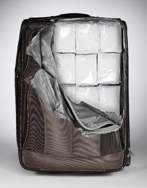
Design Update: human/drug trafficker luggage stickers.


(click images) Frustrated because you can't easily spot your generic baggage on airport carousels? Well! Vancouver design company The Cheeky has solved that problem, though they've created a potentially much worse one. Stickers are $15 each. Enjoy explaining your joke to customs officers as they ram a flashlight up your ass. Previously in: Design.

Wednesday, February 09, 2011

1936: The Nazi Graphic Design Manual.


(click images) Respect the Aryan white space! This ridiculously detailed thing was 550 pages long. Read much more about it at Design Observer. Download it here. Related: Hitler-tising—Der Führer is still moving product, baby!

Thursday, January 17, 2008

How China came up with their Olympics logo.


The army's first design was rejected as too messy. Also, there seems to be no truth to the rumors that the Chinese had help from the CIA graphics department or Blackwater's design team.
related: China's Thermal Nuclear Sperm Rockets.
(images via)

Friday, November 04, 2011

Design Nerds: cool spec Coke cup design.

(click image) A couple of months old, but just stumbled on it this morning. Anybody know whose idea it is? Coke should buy (or steal) the hell out of it. Here's a previous cool transparent package idea: the Afro cookie via Japan.

Monday, July 13, 2009

Cute business card will get Toronto massage therapist laid.


(click images) Knot bad! Non-traditional business cards are big these days. So a Toronto massage therapist named Derek Royer paid big ad agency Leo Burnett to design a cute as a fucking bug's ear card. Or much more likely, Derek Royer's big ad agency friend did it for free in the hope of winning worldwide design fame. Or Derek works at Leo Burnett. No matter, Derek just has to hand hot chicks (or studs) his knotted up piece of fabric card, and make the 'call me' motion, and he's got more action than his oiled-up hands can handle (images via).
Previously in cute fucking promo thingies: chocolate shop's dental chart promo card. NYC Museum of Sex blowjob balloons. Jontex condom semen umbrellas. Iams barbell disc Frisbee.

Monday, April 25, 2011

Today in unfortunate sexual logos.


(via MultiCultClassics) The 90-year-old Spanish fashion and jewelry design house loves their iconic bear. Via Wikipedia: "Over the years, it has become a lucky charm for millions of people all over the world," said Tous's creative director Rosa Oriol. I call implants on titty bear. Previously in: unintentional titty graphic design.

Monday, June 20, 2011

Graphic Design FAIL of the Millennium.

It edges out this classic one. Adme.ru last week posted a roundup of famous graphic design/logo mishaps. I had seen all of the bad ones, except this one, from 2008, via my favorite summer state. It is nearly unbelievable.
Previously: Logo FAIL of the Millennium.

Friday, June 24, 2011

Blasphemous Bible redesign wins Cannes Gold Lion.

(click image, via) The goal was to design a Bible that would attract "younger people." From the press note:
"The all new “BasisBibel NT” uses a very clear, modern language and is still very close to the original text. The textual structure and typography is optimised for better reading comprehension. In addition to that, the BasisBibel is cross-media optimised."
That all sounds like Devil-speak to me. Get this: the evil thing also comes in green, orange and purple (That color sold out in five months.) ALL Bibles should be dark blood red faux leather and smell like the sweat of Christ. Designer: Gobasil, Hamburg, Germany. Related: the official 1936 Nazi graphic design manual.

Tuesday, November 16, 2010

Design/Star Wars nerds: Your heads are about to explode.


(click ads, via) Ooooh, set your genitals to stunned, it's Lord Vader and Master Yoda made of fonts! The ads are for/by Italian design firm H-57, who could certainly use a better designed homepage. Sue the force out of 'em, Lucas. For you font dorks, here's two slick ads from 2008 for a German type house. And for you Star Wars dipshits, here's three previous instances of illicit Vadertising.

Wednesday, February 02, 2011

Why does this Director of Design have a swan around his neck?

(via) His name is Louis Hu. He was just hired by ad agency US Sydney. Maybe he is channeling or mocking Björk? Is it alive? Dead? Fake? Photoshopped? No matter, this is the official portrait of Louis Hu, Director of Design. Btw, here is my official portrait. Previously: What the Fuck is a Creative Director—11 official portraits.
Update! see comments for explanation.

Thursday, August 18, 2011

Ad agency steals logo. Gets caught. Says "blow me."

Left: 100-year-old logo for a defunct company called S & Co. Right: Goodby Silverstein & Partners new logo "designed" by Rich Silverstein. Agency Spy caught them. Silverstein responded thusly:
"Our new logo is old.
I’ve heard that people have been questioning our new logo.   Allow me to explain.  I’ve always loved timeless, beautiful things.  So it’s not a coincidence that the logo looks like a 100 year old ligature.  It was 100% intentional.  I found it in my library in a book of ligatures that I’ve had for 30 years and always admired.  I thought it would be nice to take something old and ignored and reimagine it.  And that’s what I did.
I enlisted the help of a few talented people in the company and with full transparency we took the beauty of the original hand drawn letter forms and conveniently changed the C to a G, removed the O, and added a P.
Appropriation is a big part of our culture.  Sampling is part of the modern music scene.  Andy Warhol’s most famous silk screens were made from other people’s photographs.   And Richard Prince blew up cigarette ads to make art.
Making  something old new again was my full intention and I’m very happy with the outcome.”
Note to Rich: you are not an artist. You are a hack ad guy.
Related: ad agencies—consistently terrible at advertising themselves.

Update: The agency entered their new logo at Cannes in June. Notice there's no mention of the source in their design description here. "Full transparency."

Friday, July 08, 2011

And here's a model with a huge starburst Photoshopped on her face.

(click ad, via) I think they're referencing the 'ol starburst sale price design element, loathed by highfalutin' art directors everywhere. I think that's what they're doing. Orange is also the national color of The Netherlands, home of this ad. Ad agency: SuperRebel. Previous cases of Phacial Photoshop Abuse here.

Wednesday, November 07, 2007

The LIES WELL DISGUISED Logo Contest.

I've received six entries since I posted about the $100 contest to design a new logo for my Lies Well Disguised column on Gawker. None yet have quite been the type of thing I'm looking for. However, I did get a laugh out of this submission from Darren featuring a plate with the airbrushed likeness of dreamy badass Alex Bogusky. You've only got one more week, so keep 'em coming!

Wednesday, November 02, 2011

Another example of why it's important to get a pro to design your sign.

(click image, via reddit)
Another example.

Thursday, June 09, 2011

Would you buy a microwave that looked like this?

(click ad, via) Called the "Spoutnik," its design seems to be obviously influenced by those first gaudy iMacs. (It's also available in orange.) Anyway, the Close Encounters diorama layout is mildly amusing. It's not for me, though.
Ad agency: DDB Paris. Related: the living room of the future! (as envisioned in 1979)

Thursday, November 19, 2009

Frosted Flakes are Gr-r-reat—even for budding misguided little gheys.


(click ads) Empowering (or demeaning, my read is fuzzy) print ads for Kellogg's Frosted Flakes ("Sucrilhos" in Brazil) by Leo Burnett Brazil. Because, it IS important for ALL kids—even gay little tigers and ugly little tigresses—to be healthy. And what's healthier than a pint of sugar for breakfast? No matter, how inclusive and progressive of the 104-year-old company! (images via) Previous homophobic ads: Gay men are not VIP men. In Australia, men with design sense must be gay. Previous scary cereal ad: Trix are for (severely depressed) kids.

Friday, June 04, 2010

Vog, that's a decent package design idea.

(click ad, via)
Well, I guess this is how the sexy eight-legged Spider-Women of Turkey catch their prey—with Vog fishnet stockings. Campaign by TBWA in Instanbul. Dude, you're dinner. Personally, fishnets don't do anything for me. Now: solid opaque, or sheer black or patterned stockings...(*bits knuckle*)

Wednesday, March 07, 2012

Example # ∞: why you should let professionals design your public signs.

(click, via Joe.ie)
The Limerick City Council wanted to do something about the GUM epidemic littering their fair sidewalks. Instead, they (probably) gave drunk (and sober) dirty-minded lads a place to drop a load. I wouldn't want the job of cleaning out that receptacle. It's nearly impossible to believe that this got produced.

Thursday, June 28, 2007

How Bad Do You Want To Be A Hack?

(click image for closer look. sorry, a bit blurry.)
The School of Visual Arts (one of my alma maters) here in NYC has been running a, well, pedestrian poster campaign on city subways, tagged: How Bad Do You Want To Be Good?
A good tagline. A good tagline that begs for some brilliant executions. But what do we get? A fucking spider web to promote their web design curriculum—a first-thought visual that any decent teacher at the school would immediately torch.
Way to inspire, School of VISUAL arts.
previously in bland visuals:
1. Banana Republic: It's Reindeer Season.
2. CIA. Central Innocuousness Agency.
3. Microsoft: Welcome to the (fake) people ready business.
4. Ameriprise: Fake chairman of the board.
5. Altria: Trees are pretty. Let's use trees.

Wednesday, January 09, 2008

AA banner ads created by high, wasted tards, apparently.


No, I checked the American Apparel Website: the High "Wasted" Short is not a new cleverly-named product (nor is the "Tap" Panty) referencing the retail chain's overt drug culture. But hey—their models often appear stoned, so why shouldn't the design employees join in on the fun? (banner found by joelajackson)